From audio encoding to geo-mapping

It is well known that the majority of innovation ideas originate from the application of a technique from one business domain to another. However, I am always happily surprised when those relations came obvious while refining a product feature.
As I was working recently on geo-mapping solutions, it was refreshing to observe that the core principles that drive the creation of geo-mapping visualization are an aggregation of the principles of audio, image and video processing.
How ? Let’s me show you.
Before I start, as a little disclaimer, to stay focused on the subject of this post, I will often explain the simplified view of complex algorithms and theories that enable those technologies. I encourage you to dive into more in-depth articles if you want to learn more on them. This field has evolved so much in the last years and continue to do so.
Communication
Communication is at the heart of humanity. And in the digital world, compromise in communication is a permanent challenge and driver for innovation. In other words, we always want to transmit more information than our infrastructure can support.
Information have various forms : documents, audio, video, images …
For each of those form, to store or communicate them, we need to find innovative ways to reduce the size of the information. Smaller size not only enable storage of the information in limited devices, but also means faster communication, as each communication is limited by the speed of the pipe that is used.
For example, a company network, your personal wifi or cellular network
In the information theory, Shannon quantify the information with the notion of entropy, and define a data communication system as a source, a channel and a receiver.
A compression method will reduce the size of the data by using an efficient description that can either preserve all the original information (lossless) and remove part of it.
The principle of lossless compression (like ZIP for files or PNG for image) is mainly realized by using indexing techniques and repetition summary.
For example, let’s imagine that we want to compress an english text by indexing. Instead of storing each character with their number on the global ASCII table, you can analyze the text and create an index of every words and compress the text by using only the index of each word.
On the image side, a repetition summary will replace a serie of 256 white points (pixels) by a description that looks like : 256-white
The challenge of the lossless compression is that the compression rate is limited to the “smartest” representation of the information. To achieve more, the compression method needs to analyze the information and remove the part of the information that is “less important”.
How to reduce information ?
To do so, we need first to change the way we look at the data, and to understand the core principle of the transformation.
For that, let’s start with an audio recording.
If we play a song and observe the evolution of the sound that we hear, we can represent it as a function that have different values with the time elapsed from the start of the song. Let’s called it the signal S(t)

If you remember your physical lessons, names like Fourier or Newton sound probably familiar.
Both of them have demonstrated in different context that : any signal can be decomposed into a sum of simpler predictable functions (harmonics). In lemon’s term, that means that any audio recording can be represented by a sum of simple signals that have different pitches (frequency) and force (amplitude)
For example, your car radio player simplify this list of harmonics into 3 groups (bass, medium or treble) and offer you to adjust independently their amplitude
Audio Compression
When we will target sound compression, we will use the characteristic of the human perception of the sound to remove the information (the frequencies) that cannot be (or barely) perceived by your ears.
On a simplified view, that means that we will keep the main variation of the sound (low frequencies) and remove the smaller ones (high frequencies).
The compression will also use the fact that a loud sound will mask the similar softer sounds that happened at the same moment
Of course, as we do this, we remove some information and the compromise is to define where is the limit.
In audio compression like MP3, this decision is made by defining the size of the information that is allowed for each second of the recording : the bitrate
The decision can be specified as constant during the entire song (Constant Bitrate – CBR) or variable overtime to follow the speed variation of the song (Variable bitrate – VBR)
As you can imagine, VBR encoding requires more analysis but produce better compression result
Image compression
A digital image is an array of points in two directions (dimensions) : columns (x) and rows (y).
Each point (or pixel) has a color that we specify with a value that is, most of the time, specified as a level of primary colors : Red/Green/Blue (RGB)
If we think signal, we will say : an image is represented by a function using two parameters: S(x,y)
To compress that image, we can use frequency simplification again because our eyes have a limited capacity to separate colors or points.
But also, as we have now 2 dimensions, we can apply more complex filtering.
For example, the JPG protocol split the image into small blocks of 16*16 pixels and store the main frequency of each block.
The storage can also order the information of frequency so that lower frequency are transmitted first, creating a progressive image display (from lower to higher detail) where the total size is similar but the user experience enhanced.
Video compression
To state the obvious, a video is an image that change overtime.
Or, back to signal, a video is a function that takes into account a 3rd dimension : the time (t)
It can be represented as S(x, y, t)
And you know that probably already as your television is the perfect demonstration of this.
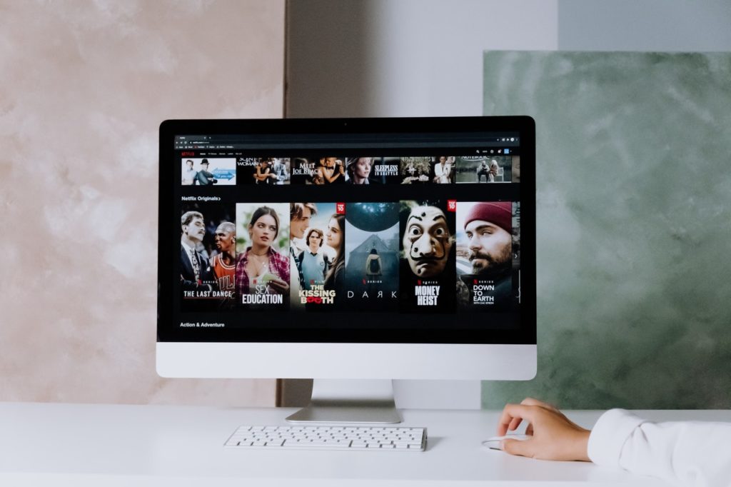
Based on your streaming application instructions (Netflix, Amazon Prime…), every dot of the screen of your television will change his color so that the overall screen render your favorite show
The first choice on video compression is the number of images by seconds that you want to have or frame rate per second (fps). Standard choices are 24 fps for cinema and 30 fps for television.
The second choice is, of course, the size of each frame : 480*640 (SD), 720*1280, 1080*1920 (HD), 2160*3840 (UHD – 4k)…
On each image of a video (frame), the image compression techniques can be applied of course.
But to take advantage of the new dimension (time), the video compression also used the notion of differential encoding : only describe what have changed.
The video compression will compare the image at a specific moment (t) to the previous frame (t-1)
It will only keep on the image the pixels that have changed and compressed this differential image
To avoid errors over time, the video will create on a regular basis, a full image description (called key frame)
As a side note, if the video have some audio channels, the channel will be compressed separately from the image, but the keyframe can be used for synchronization. Separating audio channels, allows to change language without having to duplicate the video feed.
Video streaming

When we went to the world of streaming, another challenge was added as we have to control how the information is coming from the source to the user : the network.
The main principle of streaming is that content is provided on demand : it comes when it is requested only. You don’t have the movie stored in your house and you potentially can select any content on a large catalog so the data will come from the network as a live stream.
Even if the subject is passionating, I will keep the subject of demand prediction and network delivery optimization for a further post to stay focus on data compression and delivery.
The new challenge of streaming is to perform adaptive compression.
The main idea assume that a user will prefer to have temporary lower resolution that having his movie stopped while waiting for the high resolution content to be loaded on the network.
Network bandwidth is (almost) never stable. You need to look at it as a pipe where the video traffic is mixed with other needs (home automation, computers …) that we can consider as noise. If you increase the noise, you reduce the information that you can transmit.
Instead of referring to the Shannon theory, lets take a simple example :
Imagine that you are in a room with a friend space from a few meters from each others.
If the room is quiet, you can exchange a lot together
If the room is noisy (like a bar or a discotheque), you will need to focus on the essential words.
If you cannot control the noise, you need to control what you say.
So to achieve the goal of smooth streaming, we will measure the noise of the connection and in real-time, select the quality of video that can be transmitted from the source to the destination.
How ?
First, the video is encoded by periods (of a few seconds) at different resolutions
Then the noise is measured indirectly by the variation of the download speed
The player then decide for each period what is the best resolution to request
This basic execution is then optimized by a complex optimization of the possible sources (streaming points) that can be servers (best distance and availability) or other devices (peer to peer)
Geo-mapping ?
So, you are probably wondering now, how all those principles are connected to geo-mapping ?
Well, the obvious answer start from the observation that, even if technically, I will have the ability to access the entire information of all the data of every location in the world, I will not be able to give you this information right away. The time to collect, transmit, display this information will be far more than the time that you are willing to wait for it.
One of my favorite sentence on Data Science is : “A perfect forecast model that give you tomorrow weather based on today’s information in one year is … useless (most of the time)”
So, like audio, video, streaming … we need to find efficient way to optimize the information transmission and rendering to optimize the geo-mapping experience
For that, let’s look at the specific characteristic of geo-mapping that will allows to find the best adaptation of compression to our case
Focus
The first aspect of geo-mapping is the user focus.
A geo-map is focused of what the user see which is only a part of the entire knowledge of the system
To take a simple example, imagine that you cannot see a movie and you ask me to describe it to you as it happens.
You are not interested at that moment by the biography of the actors, a similar movie that I saw yesterday or the history of the creation of the actor’s dress. You want me to stay focus on what you see.
The part of the map that the user see is called the view, and, most of the time, shaped as a rectangular box that have the same ratio than its laptop screen, phone or tablet.
On demand
Some geo-mapping system (like your car GPS) will preload the information on the device that run it. But this strategy not only limit the map to a specific level of detail and coverage, but also bring the issue of the accuracy and evolution of the information.
To avoid those limitation, most of the geo-mapping systems are using on demand principle to get the information needed by the user from a larger dataset hosted on a server.
This principle put the geo-mapping system in the same situation that a streaming application that needs to optimize the information requested overtime.
Motion
We are creating a geo-mapping not a picture of static map, so we expect that users will not stare at one specific place in the world, but instead, will move their view in different directions to find something, to compare …
When doing so, the map needs to avoid latency in the display and find efficient strategy to preload information while the user is looking at the information that is already there.
How ? By predicting the information that you are looking for.
We talked briefly about prediction for optimizing streaming by selecting the best compression rate for a video segment, the focus of the prediction here will be the geo-direction.
If the geo-mapping is provided for a navigation system like a car, the current direction and speed of the car can be used to predict the needed information. If the user has provided their entire route, the prediction is even easier
But how to predict motion when a user is sitting on his desk in front of his laptop ?
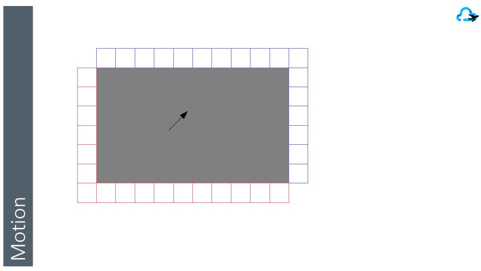
The first strategy will be to load an area that is a little larger than the user view. By doing so, small motion in any direction can be delivered right away while the system load the new edge information
Divide and conquer
Loading a larger area resolve the fluidity of the user experience, but not the refresh challenge when the user reach the limit of the area.
For that, we need to find a way to do a differential loading (like differential encoding in video) and only request the areas that are new.
As the user can move in any direction, requesting the entire new area rectangle to the server on every move, will not be efficient not only because of the size of each refresh, but also because we have already an important part of the new information needed
So, we will split the entire coverage of our mapping system into small rectangles (called tiles) so that we can load only the parts at the edge that are needed (in blue), and discard the parts on the other edge that are not needed anymore (red)

We are not equal
Before we look at more complex motion, let’s take a few minutes to look at the information on a geo-map.
To represent any information, we will need to make a major decision on the form of the information that we will select. To understand the possibilities, let’s look at a simple example.
Let’s imagine that you are running on the highway 5 in California, close to San Clemente heading to San Diego and you look at your map.
To show you the road, I can take an image (satellite, drone or from another car) and show it with all the details. This is called a raster view.
The other option is to simplify this by taking only the line that define the center of the road, and approximate the road shape based on the number of lanes. This mathematic definition is called a vector view.
Even if is seems natural to think that raster view are more data expensive than vector view, the difference will be mainly based on the level of details selected on each representation. For example, a definition of a circle (center, radius) is less expensive than an image of the circle on a full screen. But on the other hand, a detailed structure information of a building can be more expensive than a picture from the sky of that building.
Most of the time, vector view are used to simplify a visual representation (for example boundary of a state or location of a shop) and raster view are used when visual information provide additional unclassified details (like roof damage, vegetation …)
Vector view are often enhanced with some simplified images :
- A symbol to replace a point (like a restaurant icon)
- A pattern or texture to fill an area (like water or road)
Priority
Most of the maps that you are using display more than one type of information : roads, city name, traffic, population, …
The number of possible dimensions are vast, so the geo-map will be created with a selection of those.
Selecting the right dimensions for the purpose of the map is also way beyond the goal of this post and start from the business need down to the technical data science algorithms of selecting the most valuable data dimensions.
However, for the geo-map, this complex selection will end up in 2 decisions:
- The groups that can be displayed independently from each other (layer)
- The order of priority while displaying those layers
To understand layers, let’s take an example.
Let’s imagine that you are in DisneyLand and look at the map of the park. The creator of the map can have simplify this need in 4 layers
- Layer Motion : All possible paths inside the park
- Layer Food : All food location that you can look for
- Layer Entertainment : All attractions and fun places
- Layer Shopping : All shops for souvenirs or gifts
Based on your journey, you will decide to view on the same map only the information that is important for you at that time and hide the layers that you do not need.
From there, if you activate all those layers, what information needs to be displayed on top of the other ?
In the world of image generation, we have defined a very technical name for the algorithm that prioritize the visibility of the information. That is called the painter algorithm.
Yeah, not really original, but also named like this to remember the basis
When a painter come at your house to change a room, he needs to define the exact order for each of the color that he will use. Starting from the background color, then the primary one and finally the low level details…
Failing to do so, will result in an inaccurate realization and final representation
In a geo-map, each layer can be visible or hidden. But the order of display if often static.
For example, lakes are drawn first, then road, then town names. Changing this order will result in a very unpleasant map as the details that are more important (town names) can be overlapped by information of lower importance (lake shape)
Layer priority can also be used to prioritize the loading so that essential information is displayed first, and additional details layers after.
As a note, you are maybe already familiar with layers if you have worked with image tools like Photoshop or watch animation cartoons where background and characters are drawn separately
Let’s get some altitude
Now that we have analyzed the way information is structured to generate a specific view, let’s talk about the elephant in the room : Zooming in a view
The main advantage of digital geo-map is to provide the ability to Zoom in and out on any location and get a refined view of that area.
As each location is defined with a latitude and longitude, the zoom level provide the last 3rd dimension of any spatial mapping as a substitute for altitude.
If we were laying on the ground and starring at it, we would see a lot of details like small bugs moving around. If, we stand, the vision that we have is expanded, but we see less details.
Flying above the ground with a drone or an helicopter, our field of vision will expand as we loose some details. As we increase altitude, our vision can go up to a state of even a continent.
As you see, the zoom is a total proxy to the altitude with the advantage that the geo-projection models (like Mercator) map our world on a flat plan (instead of a beautiful rounded “orange”).
In a geo-map, the zoom drives two additional decisions :
- The details provided by each layer
- The visibility of each layer
Why ? Because providing the price of every house and the road around them makes sense at the neighborhood level, but will result with a messy dark map at the town level or county level.
To resolve this issue, most of the mapping systems define a number of zoom levels (for example 23 for MapBox).
From there, you can define visibility of each layers for a range of zoom.
A possible choice can be :
- Minor roads from level 5 to 10
- Freeways from 5 to 15
- Town name from 5 to 10
- County names from 10 to 15
For each layer, two strategies of data can be used
- Scale : a representation at a higher zoom level is used in a lower level
- Generate : recreate a representation for the zoom level
The first choice reduce the traffic but provide blurry effects or inaccuracy. The second choice increase the traffic needed when zooming, but reduce imprecision.
If you remember the video streaming pattern, when zooming in or out, scaling the previous zoom level even if a generated representation of that layer exists, can be a technique to compensate network latency while loading new set of tiles.
Focus on what is important
Let’s wrap it up.
As we have reviewed together, the algorithms used to render a geo-map on a user display have inherited a lot from the compression and optimization techniques of the media industry.
The need for data grouping at the lower level are derived from similar technical constraints.
However, the main work on a map is to define the point of view and the visual simplification of the data.
As each point (or shape if based on geo-spatial data) is associated with many attributes (or dimension), the creator of the map needs to decide what are the small number of data that will be displayed on each point and how generated information (like color) will be created.
To give a concrete example, a satellite or landscape image is already a choice of perspective.
The color of each point can be :
- The reflected color (based on the angle of the picture and the position of the sun)
- The heat perceived (infrared for example)
- The distance to the objective (radar for example)
- ….
For each point or shape, contextual information can be provided next to it (or on hover).
For example, a house can be highlight on a map by its size, price, number of occupants …
Creating the right synthesis information from the data for a focus map needs to
- work on the data first to select or generate the dimensions that will illustrate the most the goal of the map
- then define the visual synthesis (shape, points, heat map, 3D augmentation …) that will be the best fit for the subject of the map.
It is an amazing and exciting challenge when working with customers to see how the same original data can lead to new insights and business leads